
Working with silver light datagrid
This article will give you a brief insight on how to use basic features of silverlight datagrid. Similar to asp.net gridview, silver light data grid allows you to show data in rows and columns. However it has much more inbuilt UI features which makes it a better replacement of default asp.net grid view.
Declare datagrid
In order to use datagrid, you need to import System.Windows.Controls namespace.
Simply drag and drop the datagrid control or add the following line at the top of xaml file to add a reference to window control namespace.
xmlns:data="clr-namespace:System.Windows.Controls;assembly=System.Windows.Controls.Data"
Note: Dragging and dropping the datagrid control automaticaaly add a reference at the top of xaml file.
Then, show your datagrid on the xaml page. Simple datagrid can be declared as
<data:DataGrid x:Name="dg" Width="400" Height="300”>
</data:DataGrid>
Data Binding
Bind the itemsource property of datagrid to any data source that implement iEnumerable. Each row of the datagrid would be bound to your data source object and each column would be bound to the property of your data source object.
For example, let us consider a simple example of loading an array of letters as a column of the datagrid.
dg.ItemsSource = "Mon Tue Wed Thu Fri Sat Sun".Split();
Output of this code is
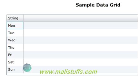
Here each row is bound to the string object and a single column is shown with name string
Now let us consider a case of loading datagrid with collection of data. For this, I have created a class with some properties as shown below
public class Data
{
public string FirstName get; set;
public string LastName get; set;
public int Age get; set;
public bool Available get; set;
public DateTime DOJ get; set;
}
Now we will create a collection of this data class in a loaddata() method as
private List<Data> LoadData()
{
List<Data> crics = new List<Data>();
crics.Add(new Data()
{
FirstName = "Mahi",
LastName = "Dhoni",
Age = 31,
Available = false,
DOJ = new DateTime(2001, 11, 10)
});
crics.Add(new Data()
{
FirstName = "Sarin",
LastName = "Mall",
Age = 26,
Available = true,
DOJ = new DateTime(2011, 05, 07)
});
crics.Add(new Data()
{
FirstName = "Sachin",
LastName = "Tendulkar",
Age = 39,
Available = true,
DOJ = new DateTime(1989, 01, 08)
});
crics.Add(new Data()
{
FirstName = "Viru",
LastName = "Sehwag",
Age = 34,
Available = true,
DOJ = new DateTime(1998, 01, 26)
});
return crics;
}
}
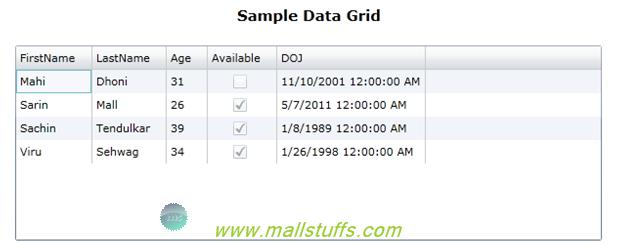
Let us now bind this collection to our datagrid
dg.ItemsSource = LoadData();
Now on running the project, my datagrid looks like:
Manual column declaration and binding
As you see in the above figure, each of my datagrid row represent “data” class and each column “property” of “data” class. This is done automatically by the silverlight runtime when AutoGenerateColumns property is set to true.
In case if you want to display only some property and hide the others or you want to do some formatting on the bound data, then we should consider manually adding the columns as
<data:DataGrid x:Name="dg" Height="200" Width="600">
<data:DataGrid.Columns>
<data:DataGridTextColumn Header="First Name" Binding="Binding FirstName" />
<data:DataGridTextColumn Header="Last Name" Binding="Binding LastName" />
<data:DataGridTextColumn Header="Age" Width="50" Binding="Binding Age" />
<data:DataGridCheckBoxColumn Header="Available" Binding="Binding Available" />
<data:DataGridTextColumn Header="Date oj Joining" Binding="Binding DOJ" />
</data:DataGrid.Columns>
</data:DataGrid>
As shown above, all columns are manually bounded to data class
DataGrid Column Types
Many types of columns can be bound to the datagrid. Some of the column types are:
DataGridTextBoxColumn -This is the standard default column internally using a TextBlock to display data, and TextBox for editing data.
DataGridCheckBoxColumn - DataGridCheckBoxColumn is a read-only checkbox for displaying Boolean value. This column internally derives from DataGridBoundColumnBase class and is used as a template for building our own column types.
DataGridTemplateColumn - This allow us to define any types of control or any number of controls inside the column.
Column Properties:
CanUserResize - This property defines whether the columns can be resized.
IsReadOnly - Determines if the column can be edited.
Width - Sets the width of the column. This value overrides the columnwidth property of datagrid.
Visibility - Hides or shows this column.
MinWidth - Sets the minimum width for this column.
Setting Row Height and Column Width
Silverlight automatically adjust row height and column width according to the data that fit into the columns, if the data is long then width of the column is increased and if data is short then the column width is decreased.
In case if you want to have a uniform row height and column width then set the column width and row height property of
The ColumnWidth and RowHeight property of DataGrid are used to set the column width and row height respectively
<data:DataGrid x:Name="McDataGrid" Width="580" Height="270"
ColumnWidth="100"