
Working with Grid control in silverlight
The Grid control is the most flexible layout panel, and supports arranging controls in multi-row and multi-column layouts. It is conceptually similar to an HTML Table element.
Unlike an HTML Table, you don't embed controls within row and column elements (<td> and <tr>). Instead you specify a Grid's Row and Column definitions using <Grid.RowDefinitions> and <Grid.ColumnDefinitions> properties that are declared immediately under the <Grid> control. You can then use the XAML "Attached Property" syntax on controls contained within the grid to indicate which Grid row and column they should be populated within.
You'll find that the Grid provides a ton of power and flexibility - and it will probably be the most common layout panel control you'll end up using.
Demo:
Let’s build a quick example on using the Grid Control
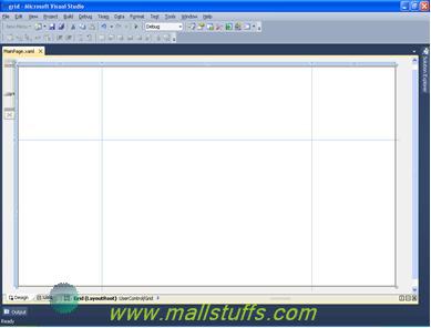
Open Visual Studio 2010 and create a new Silverlight application called Grid.
For this example, you are going to need more space than the usual 300*400 size. So, In
the MainPage.xaml file, change the UserControl’s DesignWidth to 800 and DesignHeight to 600,. Also, add few rows and column definitions as follows:
<UserControl x:Class="grid.MainPage"
xmlns="https://schemas.microsoft.com/winfx/2006/xaml/presentation"
xmlns:x="https://schemas.microsoft.com/winfx/2006/xaml"
xmlns:d="https://schemas.microsoft.com/expression/blend/2008"
xmlns:mc="https://schemas.openxmlformats.org/markup-compatibility/2006"
mc:Ignorable="d"
d:DesignHeight="700" d:DesignWidth="600">
<Grid ShowGridLines="True" x:Name="LayoutRoot" Background="White">
<Grid.RowDefinitions>
<RowDefinition Height="*" />
<RowDefinition Height="2*" />
<RowDefinition Height="Auto" />
</Grid.RowDefinitions>
<Grid.ColumnDefinitions>
<ColumnDefinition Width="200" />
<ColumnDefinition Width="*" />
<ColumnDefinition Width="200" />
</Grid.ColumnDefinitions>
</Grid></UserControl>
I've set the Grid's "ShowGridLines" property to "True". This will enable us to easily visualize the Row and Column boundaries within the Grid when we test it at runtime
Row and Column Definition Sizes
The Grid row Height and Grid column Width properties are of type GridLength. The GridLength allows for flexible property value assignment.
1. Star sizing (Proportional Sizing)
1. Is expressed as a weighted proportion of available space.
2. As seen above in the figure as well a code, the row definition uses Star sizing. second row (2*) will be giving twice the layout space as the first row (*).
3. Row or columns that are Star sized will resize at runtime if their parent Grid is resized.
4. Star sizing is the default mode for row and column definitions if no height or width is provided.
2. Fixed (absolute sizing)
1. Numeric value of type Double that defines size in pixels.
2. Value can be qualified to allow sizing to be determined in points, inches or centimeters. Example: 14pt, 2in or 5cm. The default is pixel sizing. 75px is equivalent to 75.
3. As seen above in the figure as well a code, first and third Column definitions are given fixed size.
3. Auto
1. Sizing is determined by the size of its contents. In Figure 1, the first row is Auto sized and its height is determined by the height of its contents; in this case the two Label controls.
2. Auto sized rows or columns that have no content consume no space on the design surface.
3. As seen above in the figure as well a code, third row definition is of type auto.
Let’s add some controls to our grid to explain more on grid control
<Grid ShowGridLines="True" x:Name="LayoutRoot" Background="White">
<Grid.RowDefinitions>
<RowDefinition Height="*" />
<RowDefinition Height="2*" />
<RowDefinition Height="Auto" />
</Grid.RowDefinitions>
<Grid.ColumnDefinitions>
<ColumnDefinition Width="200" />
<ColumnDefinition Width="*" />
<ColumnDefinition Width="200" />
</Grid.ColumnDefinitions>
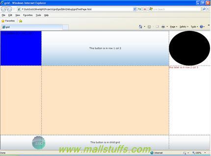
<TextBox Background="Blue" Grid.Row="0" Grid.Column="0" Text="This textbox is in row 1 col 1"/>
<Button Grid.Row="0" Grid.Column="1" Content="This button is in row 1 col 2"/>
<Ellipse Grid.Row="0" Grid.Column="2" Fill="Black"></Ellipse>
<Rectangle Grid.Row="1" Grid.ColumnSpan="2" Fill="Bisque"/>
<!--<Border Background="Azure" Grid.Row="1" Grid.Column="3" BorderBrush="Aquamarine"/>-->
<TextBlock Foreground="Brown" Grid.Row="1" Grid.Column="2" Text="this label is in row 2 col 3"/>
<Grid Grid.Row="2" Grid.ColumnSpan="3">
<Grid.RowDefinitions>
<RowDefinition Height="70" />
<RowDefinition Height="*" />
</Grid.RowDefinitions>
<Button Grid.RowSpan="2" Grid.Column="0" Content="This button is in child grid"/>
</Grid>
</Grid>
As seen above the Grid has three rows and three columns defined. The child controls are laid out according to the attached properties.
Grid.Row - assigns the row the control will be rendered in (default is row 0)
Grid.Column - assigns the column the control will be rendered in (default is column 0) Grid.RowSpan - indicates the total number of rows that the control spans within the Grid (default is row 0) Grid.ColumnSpan - indicates the total number of columns that the control spans within the Grid (default is row 0)
As seen in the output below, Rectangle is spanned across two columns of grid control. Also, we can see that grid in row 3 spanned across three columns of parent grid
Below are some more Additional functionalities collected from MSDN.
Adding Rows and Columns using the Properties Window
Rows and columns can be added and removed from a Grid by editing the RowDefinitions or ColumnDefinitions collections using the Properties Window.
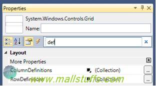
With the Grid control selected, using the Properties Window search box, enter "def" and the RowDefinitions and ColumnDefinitions collections will be visible.
Clicking on the ellipsis button will open a collection editor for adding, removing or reordering row or column definitions. Figure 11 below shows the ColumnDefinitions collection editor.
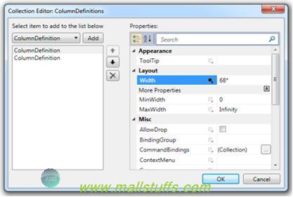
The ColumnDefinitions collection editor allows editing each of the ColumnDefinition properties. In addition to the Width property which is currently set to 68*, the MinWidth and MaxWidth properties are sometimes used by developers to provide a size range for the column by restricting the column's minimum and/or maximum width.
A ColumnDefinition can be added or removed from the ColumnDefinitions collection using the Add or Delete button.
| Important |
| | When using the Collection Editor and a ColumnDefinition is deleted, the Grid.Column attached property value is not adjusted like it is when using the WPF Designer. |
ColumnDefinitions can be reordered using the up or down arrows.
| Important |
| | When using the Collection Editor and ColumnDefinitions are reordered, only the ColumnDefinitions are reordered. The Grid.Column attached property value is not changed for any control. |
RowDefinitions have a collection editor similar to the ColumnDefinition editor.
.Grid.IsSharedSizeScope
The Grid control has a unique feature that allows either rows or columns to be automatically sized to the largest row or column in their SharedSizeGroup. The SharedSizeGroup scope is determined by the attached property Grid.IsSharedSizeScope.
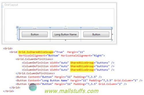
As seen above, the three ColumnDefinitions are participants of the SharedSizeGroup "buttons." The scope of their size sharing is the immediate parent Grid control. The parent Grid control has the attached property Grid.IsSharedSizeScope set to true. Each of the columns will automatically size to the largest column width in the SharedSizeGroup. Button "Long Button Name" is the widest Button control. Since the other two Button controls are using auto sizing, they will grow as their column resizes to match the widest column in the SharedSizeGroup.
Runtime Resizing of Grid Rows and Columns
The GridSplitter control provides runtime resizing of the Grid control's rows or columns.
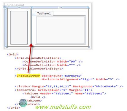
GridSplitter is located in Grid.Column zero and aligned to the right of the column. The GridSplitter control can also be placed in its own row or column. After adding the GridSplitter control to the Grid, use the Properties Window or the XAML editor to set the required properties on it.
At runtime the user will be able to resize the columns by dragging the GridSplitter left or right.
Note: Images used on this website
are either a production of Bhaktivedanta Book Trust(https://www.krishna.com), Iskcon
Foundation or were found in google search under "Free to use and share". If any
of the images presented here violates copyright issues or infringes anyone copyright
or are not under "Fair use", then please bring it to our notice. Read
Disclaimer for more.
Share this to your friends. One of your friend is
waiting for your share.
Related Articles
create new controls in grid view at runtime
Paging in silver light Datagrid
Working with Stack Panel in silverlight
Hide or unhide data using Visibility ValueConverter class
Tips and tricks with ajax calendar extender control
Show always visible content on a webpage
Change color of grid view row or cell dynamically
Working with Grid control in silverlight
Call Codebehind method from GridView ItemTemplate Eval function
Post Comment