
Working with Stack Panel in silverlight
The StackPanel provides developers with a quick layout option for positioning objects. The StackPanel
Control allows you to position Silverlight objects in more of a flow layout, stacking objects either
Horizontally or vertically. In Other Words, StackPanel control is a simple layout panel that supports positioning its contained controls in either a row or column layout. StackPanels are typically used in scenarios where you want to arrange a small subsection of the UI on your page.
Demo
To better understand the StackPanel control, Let us create a sample application.
In Visual Studio 2010, create a new Silverlight application named StackPanel
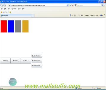
In MainPage.Xaml, Within the main Grid element, add a StackPanel control with four rectangles With different colors
StackPanel Orientation="Horizontal" Background="White" Height="100" Width="300">
<Rectangle Height="100" Width="60" Fill="Red" />
<Rectangle Height="100" Width="60" Fill="Blue" />
<Rectangle Height="100" Width="60" Fill="gray" />
<Rectangle Height="100" Width="60" Fill="Goldenrod" />
</StackPanel>

At this point, your application should look as shown above. Notice that the rectangles are stacked horizontally. If you would have not specified orientation, then the stackpanel would have rendered these rectangles vertically as vertical is the default value for orienation
Notice that all the rectangles are touching each other, which is quite unattractive. You can easily space them out by using their Margin property. Margin property separates your control from other control for the specified amount of pixel in a particular direction (right,bottom,left and top). If you specify only a single value, it will leave the specified amount of pixels in all direction.
<Rectangle Height="100" Width="60" Fill="Red" Margin="5"/>
<Rectangle Height="100" Width="60" Fill="Blue" Margin="5"/>
<Rectangle Height="100" Width="60" Fill="gray" Margin="5"/>
<Rectangle Height="100" Width="60" Fill="Goldenrod" Margin="5"/>
</StackPanel>

Microsoft designed the control framework in such a way that any object can be contained within another object. One way you can enhance your layout is by nesting a layout control within another layout control. In this example, you will nest StackPanel control within another StackPanel control, but realize that you can nest any layout control within any other layout control to get the exact layout functionality you are looking for.
<StackPanel Grid.Row="2" Orientation="Horizontal">
<Button Width="100" Height="50" Content="Button 1"></Button>
<Button Width="100" Height="50" Content="Button 2"></Button>
<Button Width="100" Height="50" Content="Button 3"></Button>
<StackPanel x:Name="sp" VerticalAlignment="Center">
<Button Width="100" Height="30" Content="Button Middle 1" Margin="5"></Button>
<Button Width="100" Height="30" Content="Button Middle 2" Margin="5"></Button>
<Button Width="100" Height="30" Content="Button Middle 3" Margin="5"></Button>
</StackPanel>
</StackPanel>
As you can see from these two exercises, the StackPanel control is a very useful layout option, and
you will probably use it often in your Silverlight applications. By nesting Silverlight controls, you have a
lot of flexibility when designing your applications
Adding Controls to Stackpanel from code behind.
Although I am showing this functionality here only for stackpanel, in reality, the same thing can be applied to other layout controls also.
Add name to the StackPanel in XAML. This will allow you to access it from the code-behind.
<StackPanel x:Name="sp" VerticalAlignment="Center">
In the code, you can add to the StackPanel by adding the element to the StackPanel's Children property.
sp.Children.Add(new Button() {Content = "ok", Height = 30 });
 here
here
Note: Images used on this website
are either a production of Bhaktivedanta Book Trust(https://www.krishna.com), Iskcon
Foundation or were found in google search under "Free to use and share". If any
of the images presented here violates copyright issues or infringes anyone copyright
or are not under "Fair use", then please bring it to our notice. Read
Disclaimer for more.
Share this to your friends. One of your friend is
waiting for your share.
Related Articles
Working with silver light datagrid
The breakpoint will not currently be hit. No symbols have been loaded for this document
Working with Dockpanel in silverlight
is Lord Kuber indian santa claus
How to sort an ObservableCollection
Working with Stack Panel in silverlight
Dinosaurs in Bhagavad Purana
Science in hinduism-Evolution in vishnu avatars
Show always visible content on a webpage
Why all gods are born in india
Post Comment