
Working with Dockpanel in silverlight
The DockPanel is a layout control, like the StackPanel and the Grid, but in some cases it is far more powerful than them. The idea of the control is that you can "dock" its child controls in all of the four directions - top, bottom, left, and right (compared to the StackPanel, which allows only two directions - top -> bottom and left -> right). The DockPanel allows you to dock the elements to the edge of the panel. The layout will have a behavior
of docking similar to that of any other windows form. That gives us pretty much freedom when designing our application's UI. Freedom in sense that the count of the nested controls will be less, which means less code and more simple structure of the XAML, or you don't have to bother to define the structure of a Grid first
Here are some basic guidelines about the behavior of the control
You can align the child controls to the top, bottom, left or right. The default alignment is to left.
The child controls take the place that is left after placing the previous child controls.
You can fill the rest of the place with the last child control. The Dock Panel does this by default.
Demo:
1. Create a new Silverlight application named Dock Panel
2. Open the file MainPage.xaml and add a Dock Panel to the root Grid and then add buttons that are docked in different positions.
As in the case of Wrap Panel, in order to get the XML namespace added for the Dock Panel, add it by double-clicking on the control from the Toolbox in Visual Studio. Then the Visual Studio will automatically add the Xml namespace and assembly reference to the page. Once the panel has been added, you can then modify the tag how you would like.
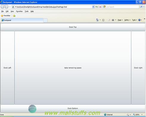
<Toolkit:DockPanel x:Name="dp">
<Button Toolkit:DockPanel.Dock="Top" Content="Dock Top" Height="50"/>
<Button Toolkit:DockPanel.Dock="Bottom" Content="Dock Bottom" Height="50"/>
<Button Toolkit:DockPanel.Dock="Right" Content="Dock right" Width="100"/>
<Button Toolkit:DockPanel.Dock="Left" Content="Dock Left" Width="100"/>
<Button Content="take remaining space"/>
</Toolkit:DockPanel>
The default dock behavior is to dock the control left. However, Using the DockPanel attached property DockPanel.Dock, we can set the DockPanel child control position in any of the four direction (left, top, right or bottom).
The secret of using the Dock Panel is to add the outer controls to the Dock Panel first. Note the order the controls added in the XAML. The last control you add should be the control that will consume the remaining space.
Note: Except for adding controls to the DockPanel, the WPF Designer does not provide additional design time help. After adding controls to the DockPanel, use the Properties Window or the XAML editor to set the properties on the child controls.
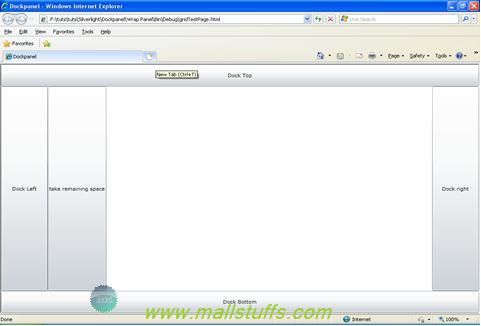
Notice that the last button placed in the DockPanel automatically fills the remaining space. This is the default behavior of the DockPanel. However, if you do not want the DockPanel to do this, simply add the LastChildFill property of DockPanel set to False.
<Toolkit:DockPanel x:Name="dp" LastChildFill="False">
<Button Toolkit:DockPanel.Dock="Top" Content="Dock Top" Height="50"/>
<Button Toolkit:DockPanel.Dock="Bottom" Content="Dock Bottom" Height="50"/>
<Button Toolkit:DockPanel.Dock="Right" Content="Dock right" Width="100"/>
<Button Toolkit:DockPanel.Dock="Left" Content="Dock Left" Width="100"/>
<Button Content="take remaining space"/>
</Toolkit:DockPanel>
Some basic Scenarios where you can use dockpanel
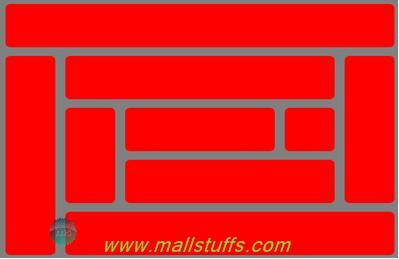
A simple WebSite
In most of the website, we show the banner at the top, then comes the menu and then the content of your webpage. It's hard to accomplish this using a Stack Panel, but it can be done with the Grid control also.

<Toolkit:DockPanel Background="Gray" LastChildFill="True">
<Rectangle Toolkit:DockPanel.Dock="Top" Fill="Red" Height="75" Margin="5" HorizontalAlignment="Stretch"/>
<Rectangle Toolkit:DockPanel.Dock="Top" Fill="Red" Height="30" Margin="5" HorizontalAlignment="Stretch" />
<Rectangle Toolkit:DockPanel.Dock="Top" Fill="Red" Margin="5" HorizontalAlignment="Stretch" />
</Toolkit:DockPanel>
Creating a path finding game
How easy this is using the stackpanel or grid control???
 here
here
Note: Images used on this website
are either a production of Bhaktivedanta Book Trust(https://www.krishna.com), Iskcon
Foundation or were found in google search under "Free to use and share". If any
of the images presented here violates copyright issues or infringes anyone copyright
or are not under "Fair use", then please bring it to our notice. Read
Disclaimer for more.
Share this to your friends. One of your friend is
waiting for your share.
Related Articles
The breakpoint will not currently be hit. No symbols have been loaded for this document
Displaying Image in silverlight Datagrid
Paging in silver light Datagrid
Working with silver light datagrid
showing row details on button click of silver light datagrid
How to sort an ObservableCollection
Working with Stack Panel in silverlight
Appending Html elements or contents dynamically
Working with server controls and HMTL controls
Working with Dockpanel in silverlight
Post Comment