
Show catchy cool tool-tips with Ajax
Introduction
Balloon extender control is a cool way of showing cool catchy tooltip to the user. It can also be used to show some custom message to the user. This control is attached to a control and whenever the focus is moved to that attached control, this balloon extender control pops up to display the custom message to the user. This control supports the following three popup styles: Rectangle, Balloon and Custom and can be shown in three different sizes: Small, Medium and large. For custom type, you need to set the custom appearance and customurl property to point to a style sheet.
Properties of Balloon extender control
Below are some of the important properties of this control.
TargetControlID - Id of the control on which you want to show the balloon popup.
BalloonPopupControlID - Id of the control which would be displayed as the balloon popup.
OffsetX/OffsetY - The number of pixels to offset the Popup from its default position, as specified by Position. Default value is 0.
Position - Position where you wanna show the balloon popup relative to the target control. Various options available are (TopLeft, TopRight, BottomLeft, BottomRight, Auto)
BalloonSize - Setting which let you define the size of balloon (Small, Medium and Large). Default value is Small
BalloonStyle - Setting which let you define the theme of the balloon popup. Various options available are (Cloud, Rectangle, and Custom).
CustomCssUrl - This will be used only when the BallonStyle is set to custom. This setting let you define the URL of custom CSS that let you define custom theme.
CustomClassName - This will be used only when the BallonStyle is set to custom. This let you specify the CSS class for the custom theme.
UseShadow - Setting which let you define whether you want to display shadow of balloon popup or not.
ScrollBars - Scroll bar to be displayed or not and in which directions, in the case where the contents are overflowing in the balloon popup control. Various options available are - None, Both, Horizontal, Vertical, and Auto. Auto will check if there is a need for horizontal or vertical scrollbar and would display scrollbar only when the content overflows in a particular direction.
DisplayOnMouseOver - This setting let you specify whether you want to display the balloon popup on the client onMouseOver event. Default is false.
DisplayOnFocus - This setting let you specify whether you want to display the balloon popup on the client onFocus event. Default is false. When the user removes the focus balloon popup hides and when the user focus on the target control, balloon popup shows again.
DisplayOnClick - This setting let you specify whether you want to display the balloon popup on the client OnClick event. Default is false.
Animations - Generic animations for the PopupControlExtender.
OnShow - This animation effect is played every time the popup control is displayed. This animation use <HideAction Visible="true" /> to display the popup along with its visual effects.
-
OnHide - This animation effect is played each time the popup is hidden.
Demo 1
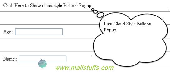
In the below piece of code, I have attached a ballonextender to label ‘lblshow’ by setting TargetControlID to lblShow. I have also set DisplayOnMouseOver=true which will show the balloon popup on hovering over the lblShow label. Medium sized (set by BalloonSize property) Cloud shaped (set by BalloonStyle property) balloon popup will be shown at the bottomright (set by Position property) position.
<div style="border: 1px solid gray; padding: 10px; margin: 10px;">
<ajaxToolkit:BalloonPopupExtender ID="Balloonpopupextender0" runat="server" TargetControlID ="lblShow" BalloonPopupControlID="pnlBalloon" Position="BottomRight" BalloonStyle="Cloud" BalloonSize="Medium" UseShadow="true" ScrollBars="Auto" DisplayOnMouseOver="true" DisplayOnFocus="false" DisplayOnClick="true" />
<asp:Label runat="server" ID="lblShow" Text="Click Here to Show cloud style Balloon Popup" />
<asp:Panel runat="server" ID="pnlBalloon">
I am Cloud Style Balloon Popup</asp:Panel>
</div>
On running the project, I can see the cloud shape balloon popup on hovering over the label ‘lblShow’ as
Output:
Demo 2:
For my second balloon extender, I have set balloonsize as small and balloon style as custom. I have set DisplayOnClick=true and DisplayOnMouseOver="false" which means the balloon popup will be shown only when I click the target control ‘txtAge’. Since the balloon style is custom, appearance of the popup is determined by the CustomCssUrl and CustomClassName properties which represents the style file name and class name respectively. If the styles file URL is wrong, default balloon popup will be shown.
<div style="border: 1px solid gray; padding: 10px; margin: 10px;">
Age :
<asp:TextBox runat="server" ID="txtAge" />
<asp:Panel ID="Pan1" runat="server" class="bgcolor">
Enter Your Age:
</asp:Panel>
<ajaxToolkit:BalloonPopupExtender ID="PopupControlExtender2" runat="server" TargetControlID="txtAge" BalloonPopupControlID="pan1" Position="BottomRight" BalloonSize="Small" CustomCssUrl="Styles/BalloonPopupOvalStyle.css" CustomClassName="oval" BalloonStyle="Custom" DisplayOnFocus="false"